
Create A Striking Nature Scene In Photoshop
In this tutorial I am going to show you how to create a nature inspired design that is both organic and visually arresting. We will be covering some useful tips as we work through the process of creating a striking image that will show a helpless being pulled into the powerful grasp of nature.
Resources Used In This Tutorial
- Mystic from Istock
- Gnarley Roots from Stock Xchange
- Big Tree Roots from Stock Xchange
- Tree Bark Texture from Stock Xchange
- Grass Brushes from Deviant Art
- X6 Grunge Pack from Deviant Art
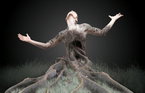
Final Image
Here is a preview of the image that we are going to be creating:

Step 1
We will be starting things off by finding a solid image of a model that we can use for our composition. I tend to use iStock for things like this. At times it can be difficult to find the right images, and you always have to keep in mind the general concept of the piece you will be creating because you want to find just the right picture for the job. I will be using an image of a man down on his knees, looking upwards towards the light with both of his arms out to his sides. A good dramatic image like this will really lend itself well for this type of moody surreal design.
Before we get into the actual designing of the image we need to isolate the man from the background. While there are several options on how to approach this such as the Eraser, Magic Wand, or Layer Masking, I still tend to favor the trusty old Pen Tool. Often times new digital artists can have a bit of trouble coming to grips with the Pen Tool but the only way to get better is to practice.

Follow the contours of the body and continue to trace around the figure until you have made your way around where you will want to close your path.

Once you have closed the path, hold the Control Key and click along the path to initiate the dropdown menu where you want to choose ‘Make Selection’ and press OK.
Next, you should see the marching ants that indicate your selection. Go to the Select Menu and choose ‘Inverse’ before hitting the delete key to erase the background from the image. Here I have placed a layer filled with black underneath our model to show you what has been removed.

Step 2
Create a new Photoshop document that is 17 inches wide by 11 inches tall, 300 dpi. The reason I am starting off with such a large size is because I know that I will be printing this piece when it’s complete and we can always reduce the size later if we need to.
Once you have your document set up, double click the Background layer and press OK to unlock it, then double click the layer again to bring up the Layer Styles Dialog Box. Check off Color Overlay and for the fill we will be starting off with #525252, which is a medium gray color.

Drag the isolated image of the model into your new document and close the original. You may choose to save the isolated image of the model for a later time, but for now we will just close it after we bring it into our new document. Press Command+T to initiate a Free Transform and then click and drag one of the four corners outwards while holding down the Shift Key to constrain the proportions of the image. We want to scale it up so that it’s large enough to fill out most of the center area of our composition as shown below:

Step 3
Switch over to your Gradient Tool (G) and select the color #313131 as shown below:

Check the settings for your Gradient at the top of the toolbar. We want a Radial Gradient that fades from solid to transparent. Be sure to also check off the ‘Reverse’ option.

Click in the center of your image and drag outwards towards any one of the four corners to create the gradient. Once you have done that and the gradient is centered, change the Blending Mode to Multiply. Below is an image of our layers thus far:

We are trying to create a sort of dramatic and moody background early on so that we can focus on other parts of the image, but it’s good to establish some type of lighting early on so as not to leave it as an afterthought. We will be coming back to this to add more to it, but so far this is what we’ve got:

Be sure to also save your work before moving on, and continue to do so throughout the remainder of the tutorial just in case!
Step 4
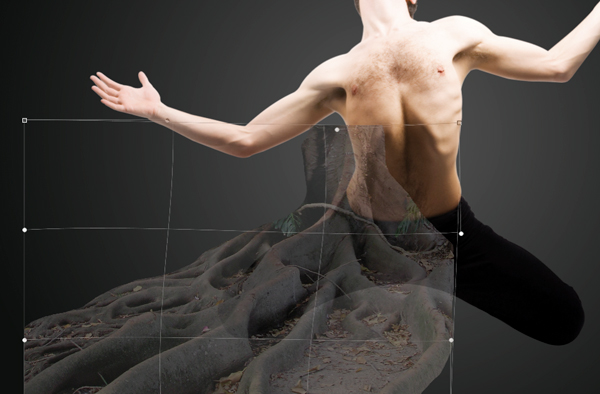
Next, we are going to open up the image of the tree roots and what we want to do is crop it so we are only left with the bottom half of the image. The top half is extraneous at this point and what we really need are the roots that will be taking the place of the legs, giving the illusion that the man is morphing and changing into the tree or being pulled into the Earth. Press C to get your Crop Tool and select the area shown below:

Once you have cropped the image, bring it into your Photoshop document. From here, place the image on top of the other layers and add a mask by clicking on the icon at the bottom of the Layers Palette, indicated by the red circle in the image shown here:

Now that we have applied a mask to the image, we can use a hard black brush to paint out the areas we don’t want. The nice thing about this is that if we mess up or need to add part of the image back in, all we have to do is paint with white. Conversely, if we use the Eraser Tool to simply remove parts of the image we don’t want, we can’t really get that back unless we keep hitting undo.
Step 5
We can now begin to mask out certain parts of the tree roots that we don’t want to be seen. It will make it easier if you lower the opacity of the layer while you are brushing so that you can also see the figure underneath.
Press Command+T to do a Free Transform and then hold the Control Key and click on the image and you will see a menu where you want to select Warp. What this will do is let us manipulate various points of the image so we have more control over the shape. We want to slide and pull different spots in order to make it blend in with the direction of the leg.
Once you are happy with the direction of the roots press the Enter Key to apply the changes. Before getting too far into the masking of the roots layer I am going to duplicate the layer by pressing Command+J. Now we can work off of the duplicated layer and turn off the visibility of the original layer below.
As you continue to paint, mask out the areas where there are leaves, and use a soft brush at a low opacity (20-30%) to blend the bark texture into the mid section of our model

Zoom in and continue masking while thinking about certain parts of the roots that we may not need. Remember that we also have the original layer underneath which we can keep making copies of if we wish to use different sections of the image that we may not need right now.

Step 6
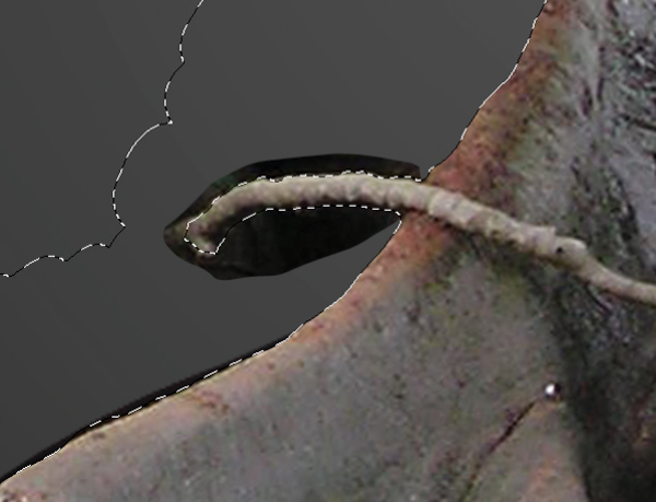
Next, select your Lasso Tool (L) and create a selection around the smaller branch that overlaps the leg as shown here:

With the layer selected, press Command+J to duplicate the selection onto a new layer. Once you have done that, press Command+T and then click on the image while holding the Control Key. When the menu appears, choose ‘Flip Horizontally’ and press the Enter Key to apply. You will also have to rotate the image upwards a bit so that it begins to follow the curve of the body. To do that it’s another transform and then rotate the image so it looks like this:

We will then apply another Warp like we did earlier and once again manipulate the shape and direction of the branch.

Notice where the branch overlaps the side of the body? All we have to do here is apply another mask by clicking the icon at the bottom of the Layers Palette and then trim it down a bit with a solid black brush in order to remove it. Try to make it appear natural so that it curves a bit at the side.

Step 7
We want to now repeat this process for the smaller branch on the opposite leg. Make another selection around part of the branch using the Lasso Tool (L).

With the layer selected, press Command+J again to paste the selection into it’s own layer. After doing that you will notice that we are losing our mask and part of the image that we don’t want visible is showing. To fix this we are going to hold the Command Key and click on just the mask thumbnail icon of the layer below. This should activate the selection.
Make sure that you are on the duplicated layer now and click on the Layer Mask icon at the bottom of the Layers Palette.

Now we will have our selection back and it will definitely save us a bit of time. From here we will once again flip and rotate the image so that it seems to follow the direction of the original piece. Paint with a soft black brush at 20-30% opacity to fade out parts of the branch that overlap the original. Use the hard edged brushes at 100% opacity to get the more precise areas.

Notice how the bottom piece of the branch appears to go behind the leg. Once you are satisfied with the positioning and appearance of the branch. Merge these layers with the main root image by holding the Shift Key, selecting them, and then pressing Command+E to merge.
If you are still with me at this point, you know the basic technique of taking certain areas of an image, selecting them, and then transforming and masking them. Let’s take a look at what we’ve got so far:

Step 8
Next, we are going to make a copy of the original tree root image, as in, not the one we have been working from but the one we started with (highlighted below):

Drag this layer down to the New Layer icon at the bottom of the Layers Palette or press Command+J to duplicate the layer. After that, turn the visibility of the original layer off. You should now have the original root image plus two more copies.
Hold the Control Key and click on the Layer Mask icon of the layer we just created and select ‘Delete Layer Mask’ from the layer. You should now see this:

This is good because we can make a different selection to use another part of the image or section of branches for the image.
Step 9
From here, lower the layer’s opacity to about 58-60% so you can see the image below. After that you will need to click on the Layer Mask icon at the bottom of the Layers Palette. Slide the image over a bit so that the hollowed part of the roots is right around the midsection of the model.

We can now begin to paint into the mask with a solid black brush and remove parts of the image we don’t want. Remove all of the image except for the area inside of the ribcage.

This part can be a bit tedious but we need to get rid of the spaces between the leaves. To do this you can simply zoom in and use a small black brush at 100% opacity. We are going to be creating a hollowed out sort of effect so we need an area where we can reveal the layer below.

Step 10
Make a selection using the Pen Tool that goes around the inner part of the midsection. Fill this layer with solid black using the Paint Bucket Tool (G) after closing your Path and activating the selection.

Open the next tree root image from the resources folder and import it into your Photoshop file. Do a quick Free Transform (Command+T), hold the Control Key and click on the image, and then choose Flip Vertically. Press the Enter Key to apply the changes and then lower the opacity of the layer. Move the image around a bit and try to find a part of the image that you think would look good for the inside of the body.

Make sure that you place this layer just above the selection that we made previously that is filled with black.

Next, hold the Control Key and click on the layer containing the new tree image we have just imported. From here you want to select ‘Create Clipping Mask’ from the menu.
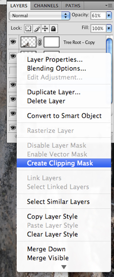
Once you do this you will notice that you have an arrow on this layer indicating the Clipping Mask.

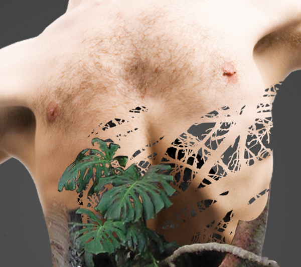
And this is what the result looks like:

The other benefit of doing this is that we can still move the tree image around and we will still only be seeing what is inside of the shape area. Before moving on we will want to also reduce the opacity of this layer to around 60%.
Step 11
Choose the color #4c3c39 and create a new layer above the previous layer setting it’s Blending Mode to Multiply. Next, hold the Command Key and click on the black shape layer thumbnail icon to activate the selection. On your new layer begin to paint with a soft round brush set to about 20% opacity. Brush around the edges so that it appears to fade in gradually as shown here:

This will add a gradual shadow that helps to give the illusion of depth.
Step 12
Import the tree vector from the resources folder and rotate it to get the branches pointing at a diagonal across the body as shown here:

Next, select your model layer, and while holding the Command Key, click on the tree vector to activate the selection.

While the selection is still active, and you are on your model layer (make sure that the layer is highlighted) and press Command+J. You will not notice anything right away, but we must now turn off the visibility of the vector tree layer. Also, the layer that we just created by pasting the selection into a new layer has to be moved up in the Layers Palette so place it above the shadow layer. Here I have turned down the opacity of the model layer so you can see what is happening:

I’m going to now repeat this step once more after moving the tree vector around a bit more. The idea here is build up a cluster of branches near the ribs so that we can mask out some of the original model layer in this area. Doing so will reveal the cluster of branches above.

Step 13
Next, we are going to add a Layer Mask to the model layer and using a solid black brush we will remove the area of the model that is showing on the side:
Open the tree-bark texture from the resources folder and bring it into your document. Change the Blending Mode to Multiply and rotate it slightly so it’s at a diagonal as shown here:

Hold the Command Key and click on the layer thumbnail icon of the model layer to activate the selection around the body. Then, with your tree-bark layer highlighted, click the Layer Mask icon at the bottom of the Layers Palette.

Continue to paint into the mask on this layer with a soft round brush set to around 20%. Use a solid black and fade out the edges of the texture so that it blends into the skin.
Add a Layer Mask to the layer beneath the bark texture, which should be the branches that are showing through the model layer. Use the same brush with a solid black color and low opacity to remove some of this area inside of the midsection to make it look more hollowed out. This will also add more depth to the image.

Step 14
Now we are going to repeat some of the earlier steps by making a copy of the tree root image, flipping it horizontally, and masking out certain areas that we don’t need. After playing with the positioning of the image I have found a nice spot where the roots appear to be going into the midsection area, replacing the plant from earlier – This seemed to give it a more hollow effect rather than covering it up completely.

Next, duplicate the tree-bark texture and lower the opacity to about 65%.

Step 15
We will now use the vector tree once again and this time, position it over the arm. Duplicate this layer and rotate it slightly so it creates a more intricate bundle of branches. Select both of these once you are happy with the positioning and press Command+E to merge them together.

Hold the Command Key and click on the merged vector tree layer. Once the selection is activated, highlight the model layer and press Command+J to paste the model into your selection on a new layer. Turn off the visibility of the vector tree layer and move the copy up in the Layers Palette so it’s above the other layers. Once you have done that you can then mask out the model’s arm to show the branches underneath.

Duplicate the tree-bark texture and delete the layer mask by holding the Control Key, clicking the mask icon and selecting ‘Delete Layer Mask’ from the dropdown menu. The Blending Mode should still be set to Multiply.

Hold the Command Key again and click on the model layer’s thumbnail icon to activate the selection and then press the Layer Mask icon at the bottom of the Layers Palette while your model selection is active and you are on the tree-bark layer. This will mask out all of the texture that falls outside of the body. Continue to paint into the layer mask with a soft round black brush at a low opacity like we did earlier on. Try to blend the texture in with the skin as shown below:

When you are happy with the result, duplicate the layer to intensify the effect. You may also wish to lower the opacity a bit so it’s not quite as strong but still stronger than it would be with only the first layer.
Repeat the same process for the opposite arm. Use the vector tree to get a cluster of branches going, then, copy the model selection into the tree area and mask out the model to reveal the branches. After that we apply the bark texture again and mask it out with a light opacity brush to blend it in.

Step 16
Next we are going to select the model layer and paint with a black brush into the Layer Mask where the lower body is (underneath the tree roots). This will remove the legs and make it appear as though the tree has replaced the lower half of the man.

Make another copy of the hidden tree root layer and flip it vertically and horizontal so it looks like this:

Mask out the area outside of the model’s body so the tree root is only visible inside. From here we want to concentrate on blending the root with the body and you will come up with some interesting results.

Step 17
Select the top layer in your Layers Palette and then go down to the Adjustment Layer icon at the bottom. When the menu pops up, choose ‘Hue/Saturation’ to bring up the interface.
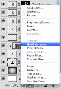
Move the Saturation slider all the way to the left to desaturate the entire image. From here, hold the Command Key and click on the model layer thumbnail icon to activate the selection around the man. Go to the Select Menu and then choose ‘Inverse’ to inverse the selection.
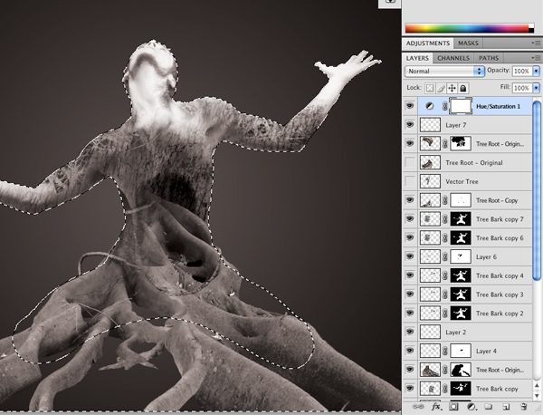
Next, switch to your Paint Bucket Tool (G) and with solid black, paint into the mask of the Hue/Saturation Adjustment Layer and it should mask everything else out so that the effect is only visible inside of the model selection.

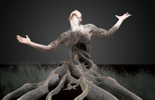
Now we can switch back to our Brush Tool (B) and use a soft round black brush at a low opacity setting to paint some color back into the image. We only want to have the effect covering certain parts of the body. Concentrate on mostly bringing color back into the face, hands, and some parts of the arms and chest. The image below shows both the before and after effects of the Hue/Saturation Adjustment.

Step 18
Switch to your Gradient Tool (G) and select the color #231B1C.

Create a new layer and move it just above the background layer before switching to your Marquee Tool (M) and making a rectangular selection to represent the ground. Once you have the selection active, fill it using the Paint Bucket.

Load up the Grass Brushes from the resources folder and select the brush from the set that is highlighted below:

Create another new layer above the ground layer. Select the color #4D6852 and begin to paint in some of the taller grass behind the tree.
Create another new layer just below the top Hue/Saturation Adjustment Layer and begin to paint in some more grass. Remember to vary the size of the brush using the left and right bracket keys and focus on filling in the dark spaces between the tree roots in the foreground.

Add a Layer Mask to the grass brushes layer by clicking on the Layer Mask icon at the bottom of the Layers Palette. Begin to brush over parts of the tree roots where the grass brushes have overlapped. The idea here is that we want certain parts of the grass to appear as though they are behind the tree roots as shown below:

Step 19
Duplicate the ‘Faded Edges’ layer that we created earlier on in the tutorial. We want to place one copy above and one copy below the background grass layer as shown here:

Next, on the grass brushes that are behind the tree (not the ones in the foreground), we want to add a Layer Mask and paint around the edges with a soft round black brush at a low opacity setting. This will gradually fade the background grass out into the background.
Continue the process of adding grass behind the tree with the grass brushes and masking certain parts out to build up a solid base. This will also help to distinguish the foreground, middle ground, and background.

Step 20
Create a new layer just below the Hue/Saturation Adjustment Layer and named it ‘Airbrushing’ as shown here:

Next, while you are on this new layer, hold the Command Key and click on the layer thumbnail icon for the body, and each of the tree roots separately so that you have a selection around them.
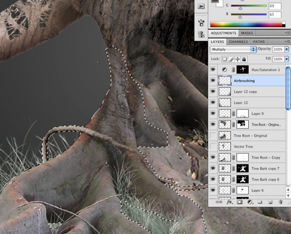
Change the Airbrushing layer’s Blending Mode to Multiply and with a soft round brush at a low opacity (10-20%) begin to sample colors from the darker areas and paint into the Airbrushing layer while the selection is active for each part. This will ensure that no paint goes outside of the lines!

This is a similar effect to using the Burn Tool (O) and will help to achieve a higher contrast image.
Step 21
Next, open the smoky texture from the resources folder and import it into your document. You will need to scale this up using a Free Transform (Command+T) and remember to hold the Shift Key as you drag one of the four corners of the image outwards.
Notice where ‘Layer 13’ is in the Layers Palette – between both of the faded edge layers. Change the Blending Mode of the texture to Overlay and reduce to the opacity to about 70% as shown below:

Create a new layer above the texture layer and with your Gradient Tool (G) apply a solid black-to-transparent Linear Gradient that fades into the texture as shown here:

This will give a more gradual fade, as we want our texture to be pretty subtle and appear as a fog in the background. We will now do the same to both the upper left and right corners by creating a new layer for each and dragging from outside the corner into the image. Reduce the opacity of these layers a bit so the black isn’t quite as stark.

Step 22
Switch over to your Gradient Tool and pick the following colors for your settings:

For the muted purple-gray color I am using #707073 and for the muted pink color #A0777A. Create a new layer above the black gradients that fade into the image and click somewhere in the center of your image and drag upwards. Once you have created your Linear Gradient, change the Blending Mode of the layer to ‘Color’ and you should have something like this:

Next, create a Layer Mask for the Linear Gradient and change the colors to black and white in your Gradient Settings Dialog Box. From here we just want to click and drag downwards to mask out the muted pink color so that the only color that remains on this layer is the grayish-purple. This color seems to blend better with the gray from the smoky texture.

Step 23
Next, create another new layer, just below the model layer. What we want to do here is make it darker behind the model – Because we have a lighter area in the center of the image, we can’t tell that there are certain parts of the body that are wearing away and turning into branches. On the new layer you can paint with s hard 100% solid black brush to fill in some of these gaps. The image below shows the design with this layer first turned on, and then the second image shows the layer disabled.
With the black layer on:
With the black layer off:
You can see that this helps to bring some of the nice detail back into the image where we started to lose it.
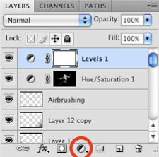
Step 24
Select the top layer in your Layers Palette so that it is highlighted. After that, click on the small black and white icon at the bottom of the palette to bring up the Adjustment Layer Menu. Select ‘Levels’ and it should add a Levels Adjustment to the top of your Layers Palette.
Move the black slider to the right a bit so that it is set to 6 as shown here:

Step 25
Next, go to the Image Menu and select ‘Canvas Size’ to bring up the dialog box. Click the down arrow so that the height adjustment we make will only affect the top of the image. Essentially by doing this we are adding a bit of extra room on the top of the image, rather than on the top and bottom evenly.

Add three inches to the height making the canvas 14 inches tall and press the Enter Key. You will notice a few of the layers getting cut off initially, but we can fix this quickly.

Go to the Background layer and press Command+T before dragging the top middle handle upwards to extend it so that it goes to the top of the canvas. If there are any spots where it doesn’t connect or the image isn’t solid, simply fill it in with a color sampled from the background.

We have added a bit too much room to the top so with our Marquee Tool (M) drag a selection around the image, roughly about the same size as the image below:

Go to the Image Menu once again and choose ‘Crop’ from the menu.
Step 26
As a finishing touch for our design I want to add a bit more atmosphere and detail to the background. The scene is supposed to be a forest, but a foggy forest. So what we want to do now is create a new layer above the smoky texture layer and just make a tall rectangular selection using your Marquee Tool (M). Fill the selection with a dark color from the background using the Paint Bucket Tool (G) and then lower the opacity to around 30%.

Duplicate this layer a few times and spread out the selections in the background. Also use a Free Transform (Command+T) on each of the rectangles to make them different widths. This will give the illusion of depth and show some distant trees, helping to make the scene feel more dramatic and dark.
Once you have done that and are happy with the results, be sure to save your work. I hope that you have picked up some useful tips in this tutorial now that we have created a dramatic scene in Photoshop with just a few images and some useful techniques. Thanks for following along, and happy Photoshopping!
And We’re Done!
You can view the final outcome below. I hope that you enjoyed this tutorial and would love to hear your feedback on the techniques and outcome.
Download Source File for this Tutorial
Tips and Tricks for Freelance Graphic Designers
Keep Persistent

The most important tip for freelance graphic designers is persistency, which is a key item in such a profession. The main reason for it is that most operations do not get off the ground for quite some time and at first you may make barely gain enough earnings to survive. So it is better to stay put to the long term benefits and keeping your focus on the big picture is extremely important.
Don’t Undersell Your Services

It is a general trend that when freelancers first get into the freelance business, they often undersell their selves in order to get more work and gain recognition in the market. This technique does them good for initial few months, however, when they do get recognized in the field and start having proper work, they get into serious trouble. And a moment comes when you start realizing that you are working 120 hours a without getting paid enough.
To cope with this situation it is advised that once you build a strong relationship and understanding level with your client, speak with the client directly and let them know that you need to raise your pricing due to increased work volume and rising company costs. Another benefit of increasing your price is that as the volume of your work expands, you can filter out the clients that are misers or troublesome. Your expanding client volume much of the time means that clients either have to find another service provider or make it worth your while to fit them in.
Know Before Quoting

Getting to realize that there is more work than you thought it will be and so you quoted wrong, is the worst discovery. This is one problem freelancers often get into and find themselves in trouble when they find themselves between devil and the deep blue sea.
In order to avoid this confusion, you retain your professional status in front of the client. Do remember that you are a professional graphic designer providing your services on a proper pattern. If a client tries to impose on you that they know it is a small and easy project and would not cost much, then ethically you should either try to persuade them otherwise or just leave the job. You need to take the time to assess the task, gather the material and make your own judgment with how easy it is, how long it will take you to do the job
So always commit to the job at the price that you feel is appropriate and in accordance with the hardwork u put into the work. If the client declines, then bargain a bit on pricing keeping your integrity and client both at winning end.
Market Yourself Best

There are very few businesses in the world that can run without proper marketing and freelance graphic designing is definitely not one of them. Yours and your brand’s market image counts as much as your skills in the field.
For freelancers, there are many ways to market themselves and their business. One of the most important mean of marketing is ‘word-of-mouth-marketing’ which not only spreads a word about your work, but also helps others get authentic views about you. Speaking on design community forums and posting to website galleries are great ways to gain credibility. With credibility, the word about you will spread like wild fire. Other mediums of marketing can be website, blogging and other social media marketing tools.
Note: always keep your business card handy, you never know where you might find a potential client and your business card speaks the first word for your work.
Focus on Business Expansion

Although it is better to start the business with a specialized field of graphic designing, however, as the business increases, you may find yourself in trouble with one skill only. Basically, when starting your freelance operation you obviously have target markets in focus that you are currently dealing with. Then shortly after you start your business, you need to be thinking on other areas that your skills can be applied. In other words your basic goal should be to broaden your scope of business.
Where to Find Clients

For freelancers, finding new business is the top priority. Their every action and move is aimed at finding new clients and new work from existing clients so that the business keeps running. Also, freelance graphic designing is the kind of business in which your existing clientele is unreliable and inconsistent. So finding new clients is quite inevitable.
The places where my freelance fellows can find new clients can be many. There are many websites on the Internet that offer projects for freelancers that will aid greatly in finding clients and work for your freelance business. Although, in the course of finding new clients, you often have to bid much below your cost estimate in order to get clients hooked fast, however, I think it is a good practice that allows you to stay in the business and you can always raise your prices slowly.
Client Relations

Getting new clients is not difficult; however, maintaining them well is more important. Building strong relationships with your clients is absolutely inevitable. This often means going an extra mile to please them to strengthen your relationship. Being punctual, writing greeting emails and getting their feedback are a few things to start with. The other things to follow are: sending updates, communicating regularly, showing a strong portfolio, a professional looking website, providing references and client testimonials, meet your deadline or be early, being straight up with your client.
The Round Up
Starting and maintaining your freelance graphic designing business requires a lot of hard work and patience. It is a general perception that freelance work is all fun and games because you get to sit at home and work when you choose. This is not at all the case. Remember, that at the end of the day the only person responsible for the success or failure of the business is you yourself. You will have no one else to blame or be angry at, in case you fail. So try to learn the tricks of this trade as soon as possible for your own good and the good of your business.
Windows Paint
It's time to saddle up "Old Paint" and do some serious doodling. I am referring to your Paint program that comes packed in the Windows Accerrories group of folder. It is easy to use, versatile, and quite accessible.
The first thing you might notice when you open Paint is the nice white area in the window, a blank canvas waiting for you to express yourself. To the left of this "clean slate" is the toolbar, pairs of buttons lined neatly down the side of the window. Hold the mouse over each button for a second and watch it identify itself. Information will also appear at the bottom of the window if you click the word View and make sure Status Bar has a check mark beside it. Clicking on a button makes it active. You can only use one tool at a time.
 The first pair are the Free Form Select and the Select tools. These allow you to select certain parts of your picture and move them to other places. Use these tools to cut or copy a section, and put it on your clipboard for use in another application. The one shaped like a dotted star will allow you to take your mouse and, while holding down the left button, outline anything in an open picture. The other will let you select a square section at a time. Once the area is selected (it will have an outline around it), placing your mouse in the center of that area will cause the pointer to change to a 4-pointed arrow. When it does, hold down your left mouse button, and you can literally lift that entire area out of the picture and move it somewhere else. When it is placed where you want, click outside of the outline area to lock it in. Note...once you have it locked in, you won't be able to click on it and have the outline reappear (to move it somewhere else). You would need to start all over. Fortunately, clicking on the word Edit and Undo will let you undo quite a few "boo boos".
The next pair down are the Eraser/Color Eraser and the Fill With Color tools. These work hand in hand with the color pallet available at the bottom of your screen. If you click your right mouse on a color, you will see one of the squares to the left of the pallet change to that color. This also applies to the left mouse button. When you click your left or right mouse button on your work area, depending on which tool is active, the button will produce that color. You choose the colors with your mouse buttons and the tools do something specific with those colors.
When you click the Eraser tool, you will see an extra section of settings to use with it in the same area as your color choices. Clicking on one of these lets you choose how big an area you want to erase at one time. Once your choice is made (with the left mouse button), just "draw" on the area you want to erase. Drawing is done with one of your mouse buttons held down. The color depends on what your choices are for each mouse button.
The Fill With Color tool looks like a paint can tilted over a bit. When it is the chosen tool, you can click on any area in your artistic creation and the color of that area will be replaced with a new color. After your first few misses, you will discover that if you don't have the little dribble well inside the area you want to recolor, you could get
unexpected results!
unexpected results!
 The little eye-dropper is a Pick Color tool. Once you click on it, you can tap with it on any color in your drawing and that will be the new color for your left mouse button. After the new color is chosen, you will immediately be taken back to the last tool (or brush) you were using. Use it to expand your color choices.
The Magnifier tool looks like a magnifying glass and does just that. Click on it once, then click on the spot in your drawing that you would like to see enlarged. There are additional zooming choices at the bottom of your screen when this tool is selected. Click the Magnifier, then click the zoom choice, or just click on the section you want ZOOMED!
Just below the Pick Color tool (eyedropper) is the Pencil, aptly named because of the way it looks. Clicking once on this will allow you to sketch in a freeform manner on your picture. the Color Box at the bottom of the screen gives the option of selecting a different color for the right and left mouse buttons. Drawing with the left mouse button held down will produce one colored line, and holding the right mouse button will produce another color. This tool remind me of an Etch-A-Sketch I had when I was a kid...little control, but lots of fun!
 Color Box ...
The Color Box lets you know the current foreground and background colors. To paint with the foreground color, click the color you want with the left mouse button and drag the pointer with your left mouse button held down. To paint with the background color, click the color you want with the right mouse button and drag the pointer with your right mouse button held down. To select a color, use the right mouse button for the background color and the left mouse button for the foreground color. It really is that simple!
Next, to the right, is the Brush. Once selected, another set of choices are available below the toolbar. You may have to click on the word View at the top of your menu bar and uncheck your Color Box so you can see them better. Experiment by clicking on each of these choices and watch the brush strokes change. The Brush is also able to give you right and left mouse color choices.
My favorite is the Airbrush. It looks like a spray paint can. Extra "splatter" choices should appear at the bottom of the screen when this tool is chosen. If you really want to vent some serious frustrations, try opening the Mona Lisa and test your graffiti skills. Your mother-in-law may also need a few "touch ups". Just don't let your spouse catch you at it. They might not appreciate the mustache on the old gal as much as you do.
The Text tool is the button with the capital A on it. When this tool is clicked and the mouse is brought to the drawing area, you should see something that looks a little like crosshairs. Text has its own special toolbar that you need to bring up at this time. Click the word View and make sure Text Toolbar has a check beside it. This is where you get to choose the font and size of the type you are going to be using. Once you decide on a font, choose the color you want to use with the left mouse button. Now, click on the drawing area and get ready to type your message. The neat thing about the text tool is that what you type automatically stays on top of the picture. If you have a favorite clip art image you would like to add a little personal message to, this is the way it would be done. I must mention that when adding text to a photo or clipart image, you will only have one chance to place it. It needs to be right the first time, because once you click somewhere else on the drawing, you will be beginning another "text box". The more elaborate drawing and paint programs give a lot more flexibility with text than this basic application does. It can still get the job done though, and everything you learn while working with this program , will prepare you for other painting and art programs you may wish to use in the future.
Guess what you will be doing when the Line tool (just below the airbrush) is selected? To choose the width the line will be, click a line width from the bottom of the tool box. To choose the color the line will be, click a color. To draw the line, drag the mouse from the beginning of the line to where you want the line to end. When you let go of the mouse button and reposition it on the drawing, you will begin another line. Use the left mouse button to draw with the foreground color, or the right mouse button to draw with the background color. To draw a perfectly horizontal, vertical, or 45-degree diagonal line, press and hold down SHIFT while dragging the mouse pointer.
The Curve tool is next to the Line tool, and it helps to create curves. Once the line is drawn, you can "pull" it to form shapes and curves. Different line widths are available at the bottom of the toolbar, and left and right mouse color options are available. Experiment with different colored lines and curves on a new drawing. Use the Fill with Color tool to fill in some of the areas. You might end up with "Wallpaper" material. That's when you give your new picture file a name with a .bmp extension, and store it in your Windows directory. When you right-click on your desktop (Windows 95) and choose Properties, your file will become one of your wallpaper choices.
The last four tool/toys are the Rectangle, Polygon, Ellipse, and Rounded Rectangle. These give you the shapes you need by simply clicking on the one you want, and dragging your left mouse button over the area you want to cover. If you hold down your SHIFT button while you are dragging, you can have a perfect circle, square, or rounded square. Holding down the SHIFT key while drawing applies to a lot of high powered programs. Does that mean it's some sort of common command? Hmmmmm...I smell a consistency fish!
Most of the commands discussed in this article also apply to other drawing and paint programs. Everything you learn fiddling around with MS Paint will increase your skills and can certainly be applied to other Windows programs. You might also fool around and have a little fun!
No comments:
Post a Comment